The Alisa Ann Ruch Burn Foundation (AARBF) is a non-profit organization driven to significantly reduce the number of burn injuries through prevention education and to enhance the quality of life of those affected by burn injuries in California. They offer abundant services, programs, camps, and scholarships that are all focused on burn prevention and empowering burn survivors and their loved ones.
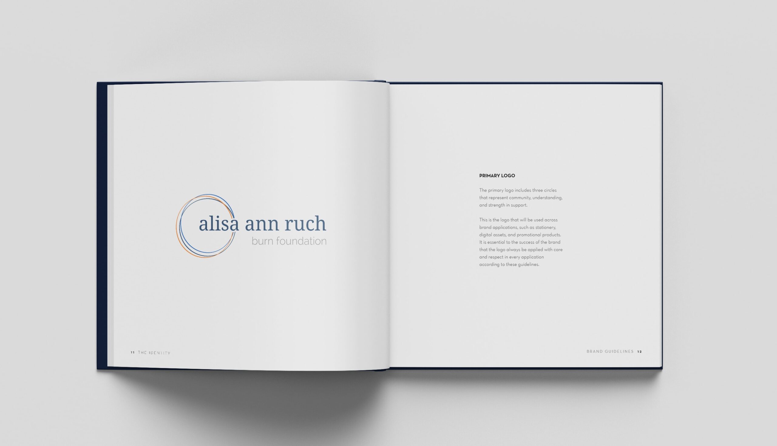
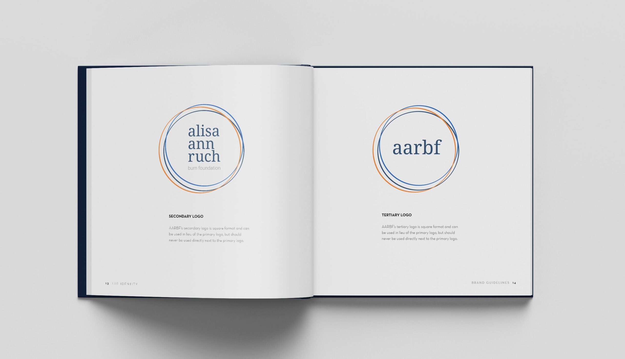
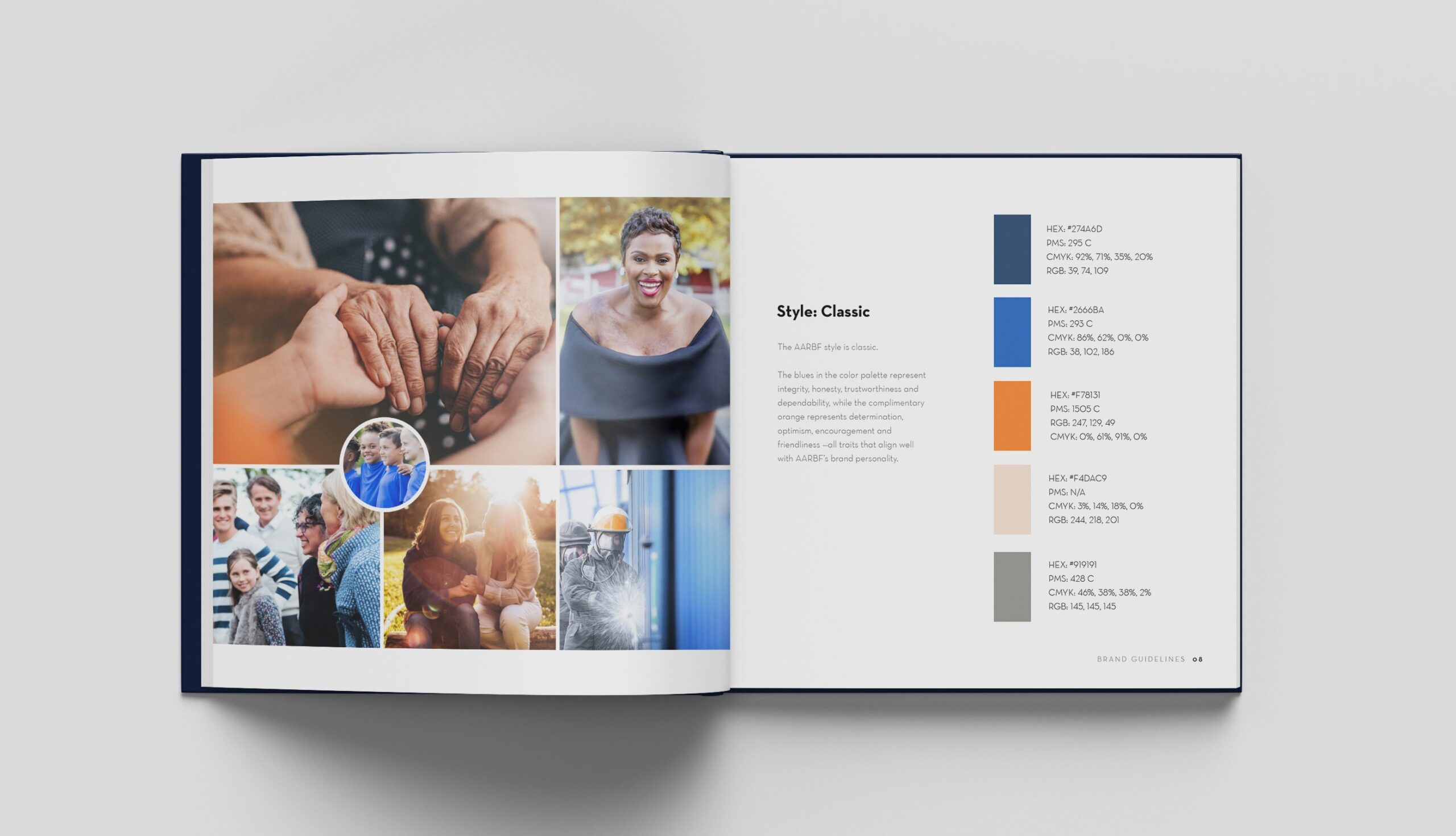
After enlisting Archer & Hound Advertising, we established that our collective goal was to update their logo, website, and brand to match their modern approach to their cause. We began by conducting surveys and focus groups among different audiences, including volunteers, survivors, donors, referral resources, and people who had never heard of AARBF. These groups shared opinions on the brand, mission, services offered, and general perception. Those collected responses served as our guide in creating a new logo and brand guidelines for the organization. Once the new brand guidelines were established, we began writing and designing their new site.
The rebranding and website redesign began in March 2018, and the goal for completion was clear: Alisa Ann Ruch’s 56th birthday was on September 8, 2018, and they wanted to host a donation drive through their new website that encouraged visitors to donate $56 in honor of Alisa. We needed to complete everything in time for the special donation landing page to be built and for the donation drive to be publicized. The rebranding served as a catalyst for website views and social media clicks, which then lead to a generous amount of donations. The donation drive raised more than $7,000, a hugely significant amount of money for this organization.
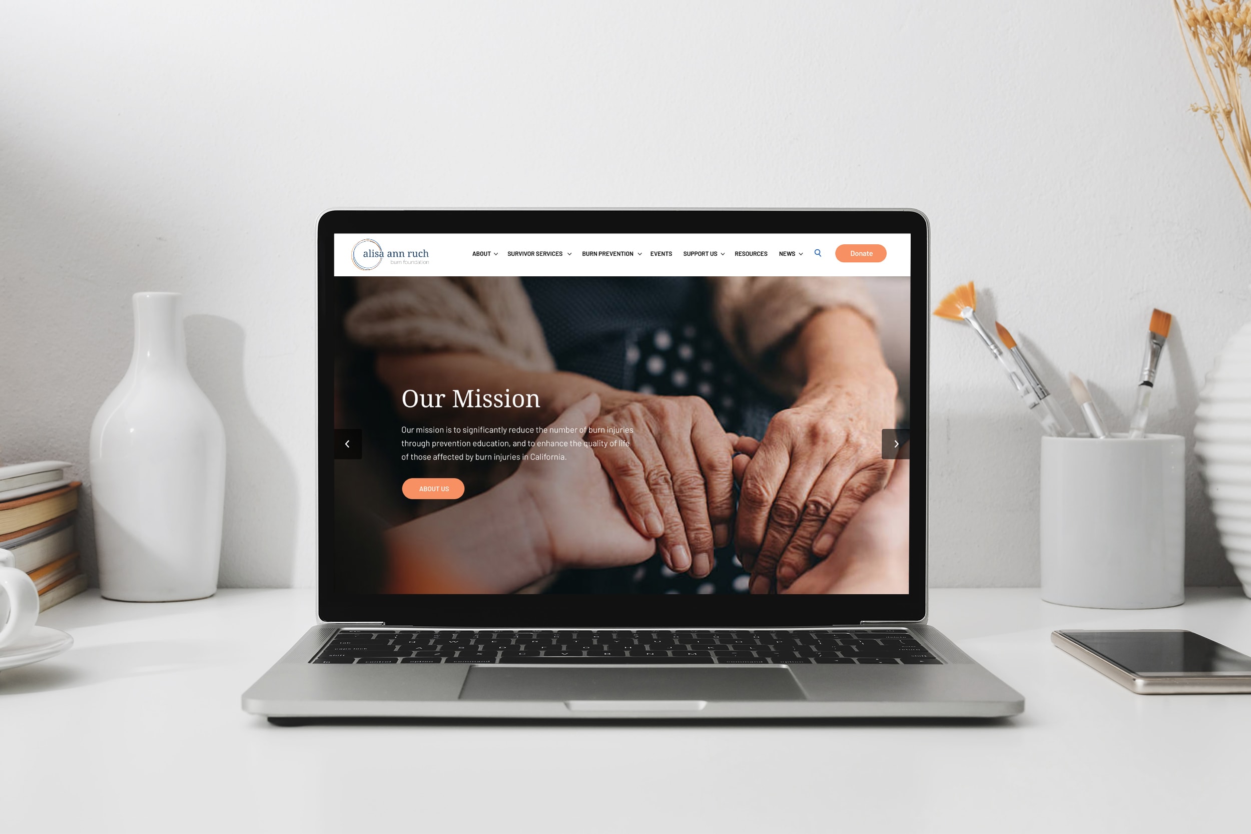
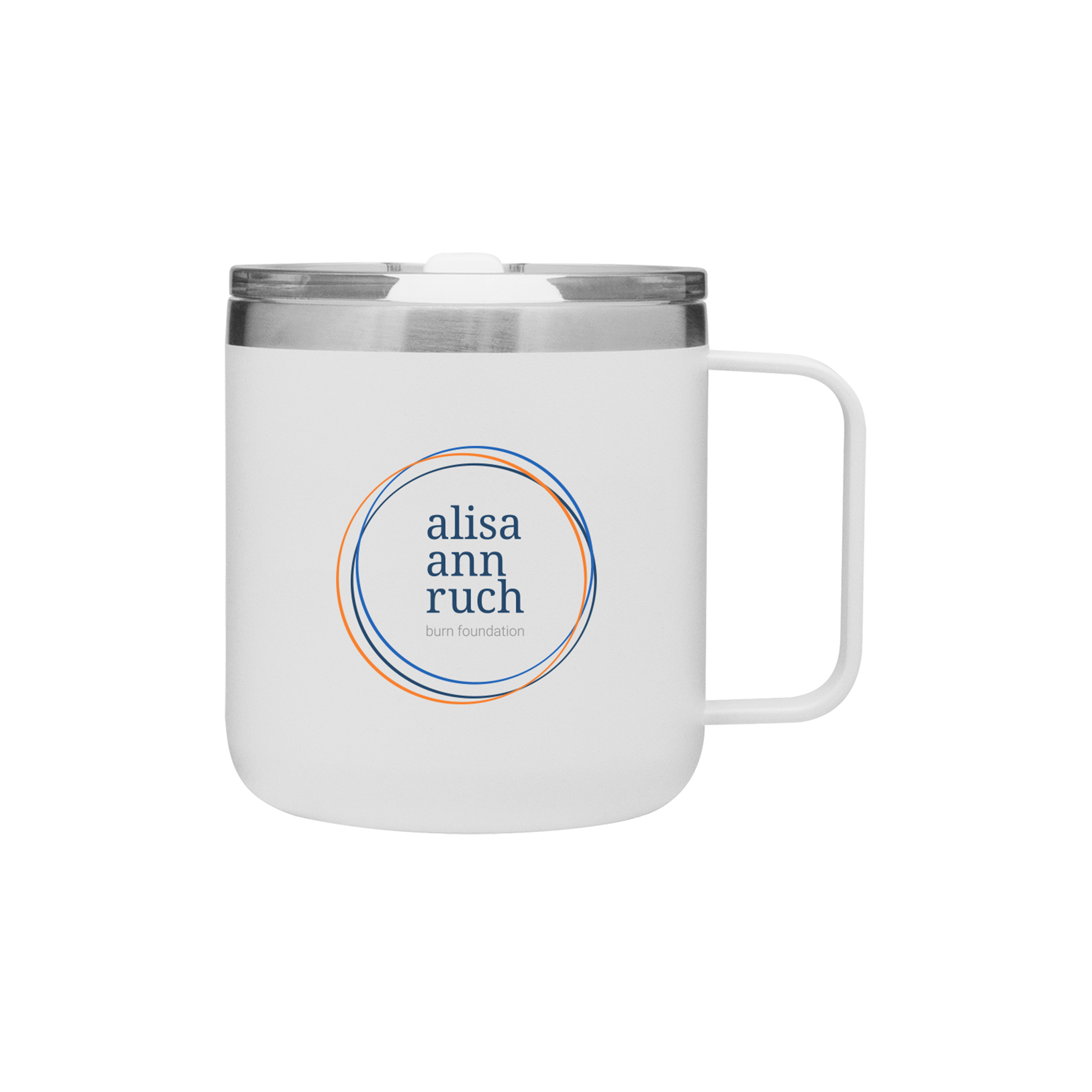
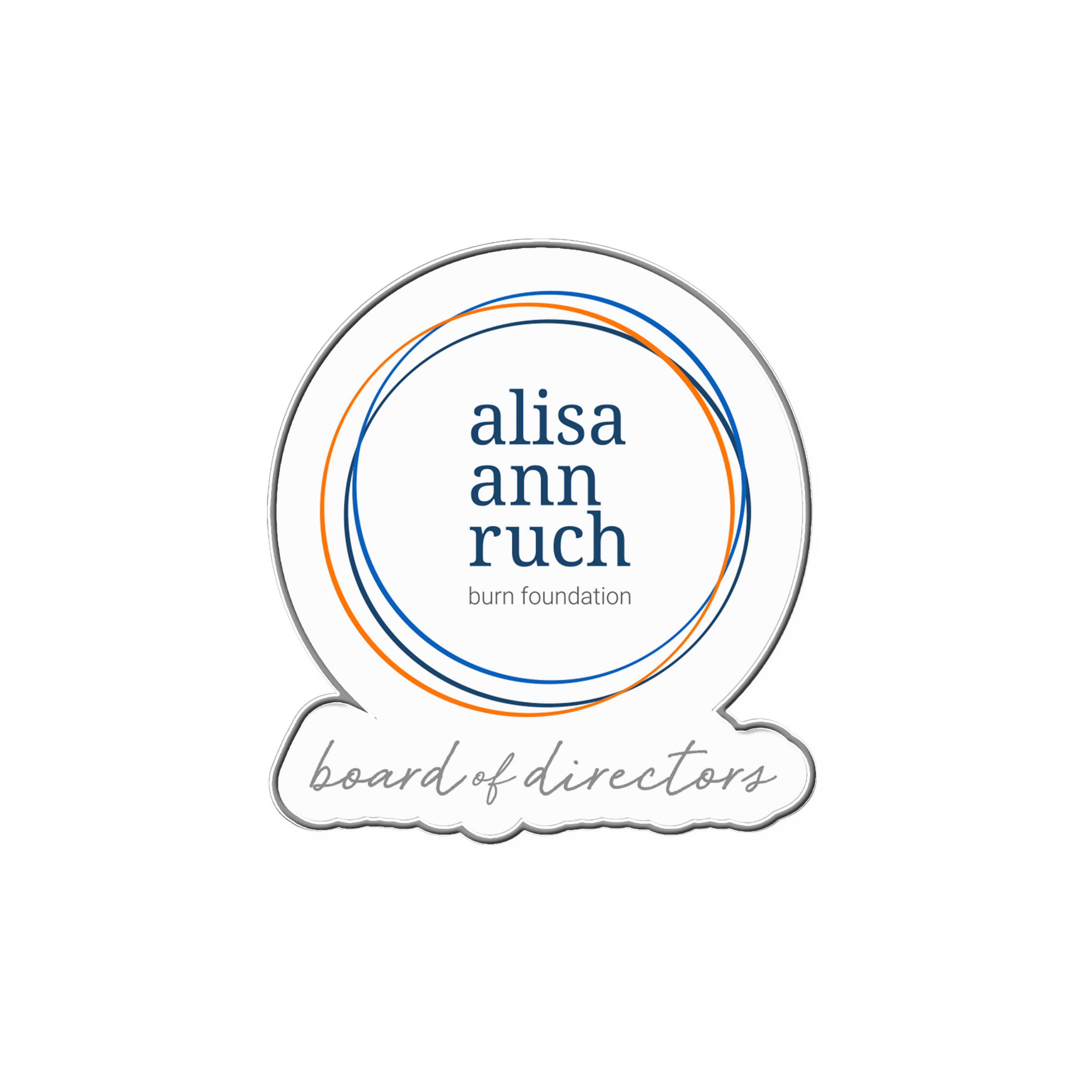
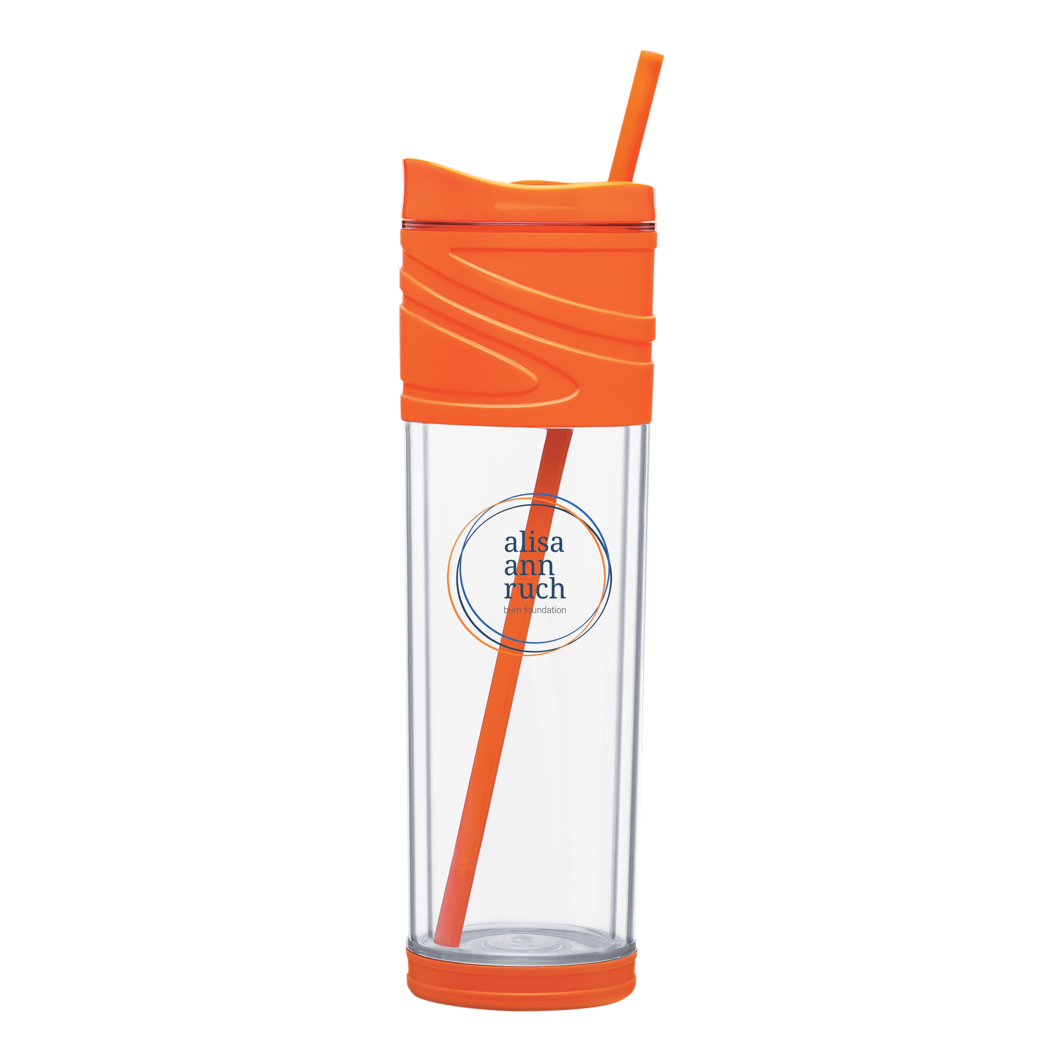
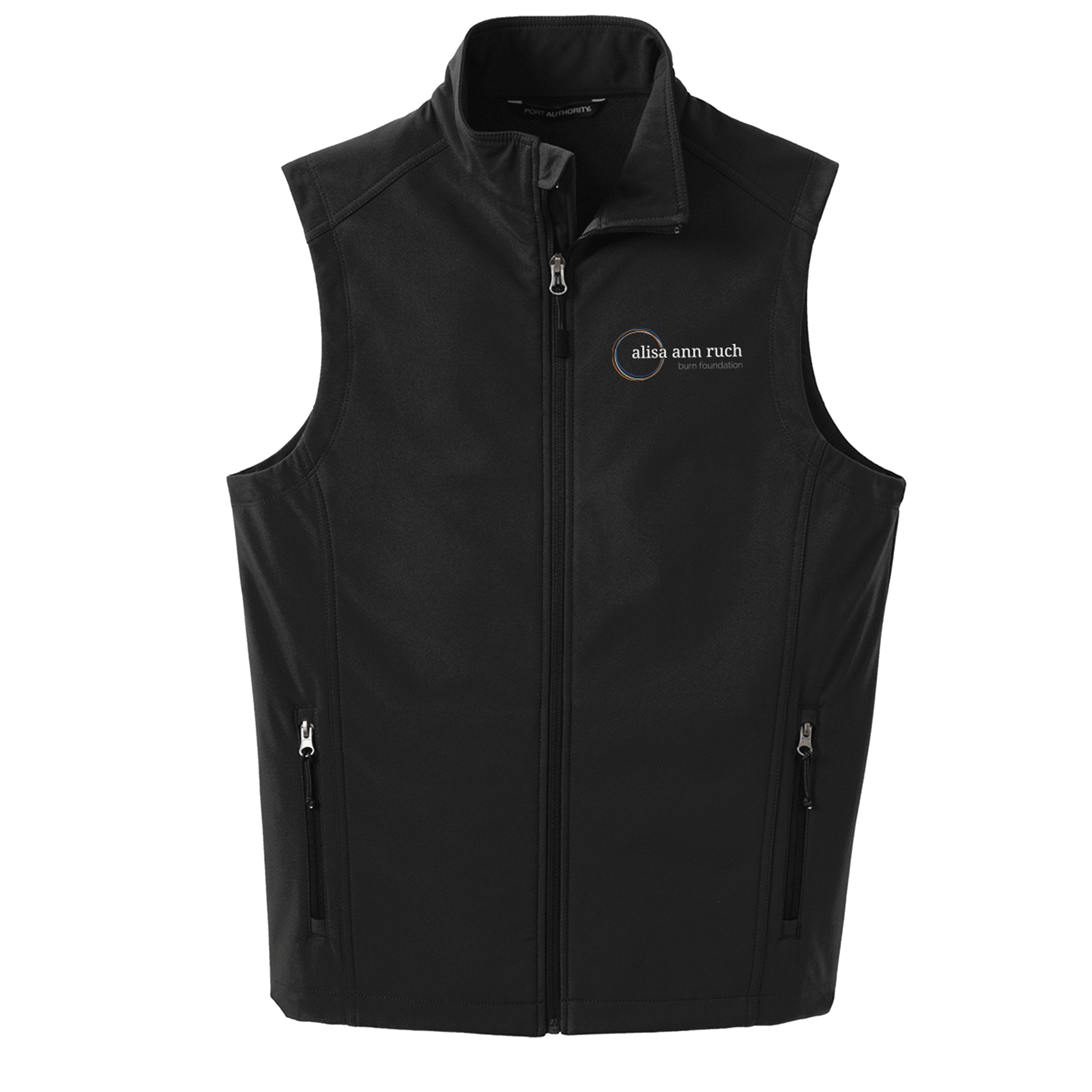
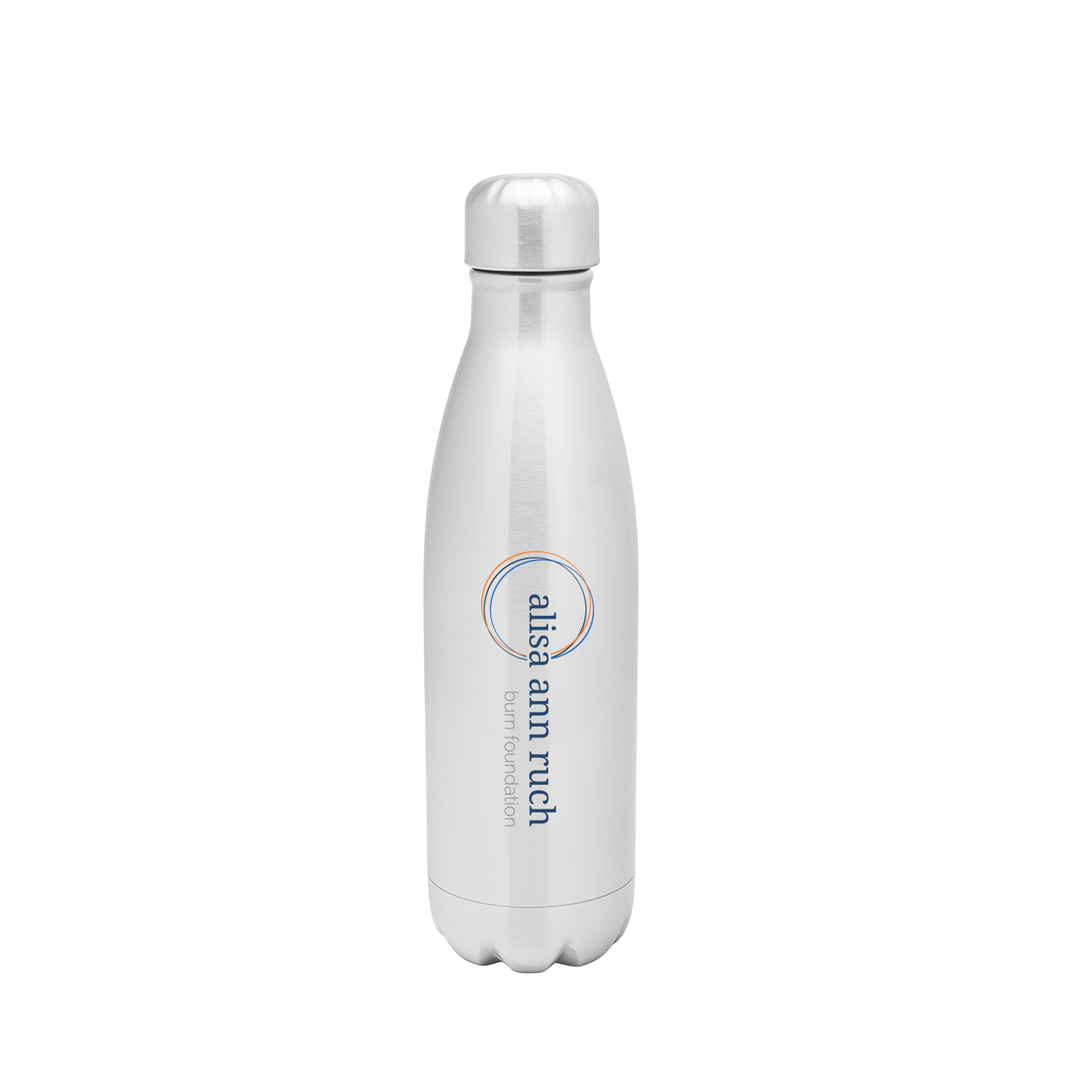
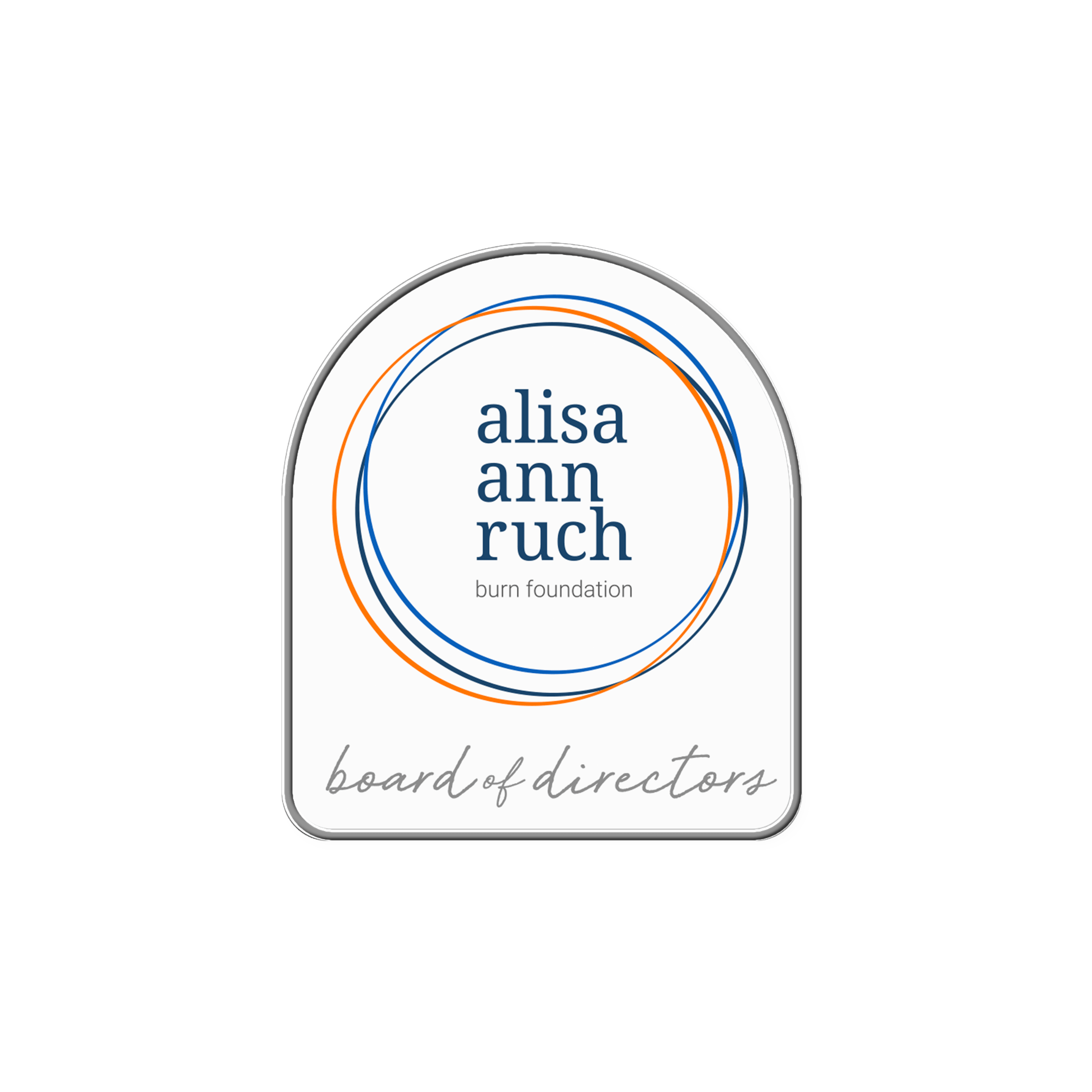
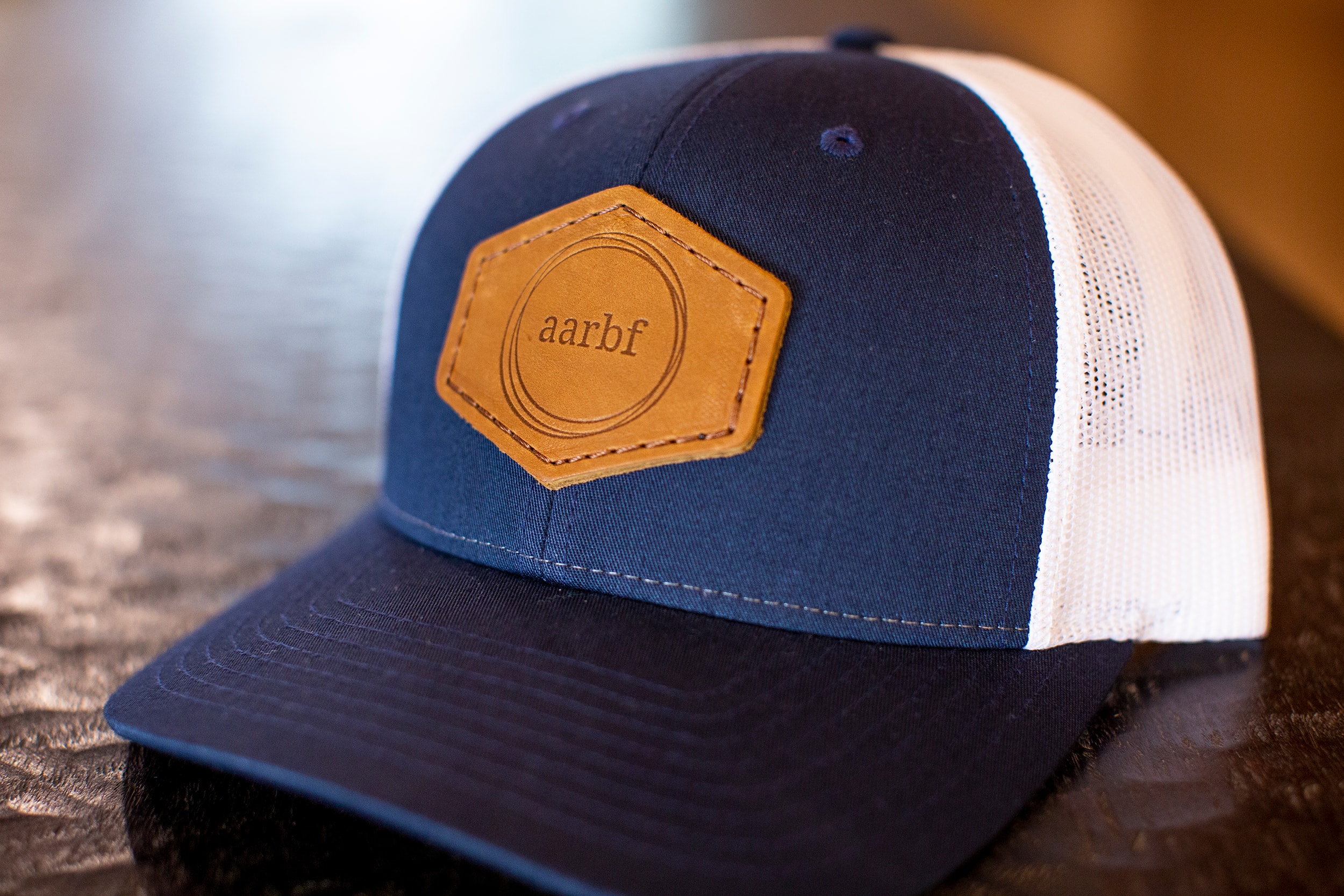
Using our holistic brand approach, the new logo was also applied to some new apparel and accessories so that staff, volunteers, and event attendees could represent the updated brand. We created a color-coordinated system that represents the various levels of staff, interns, volunteers, and survivors, assigning a visual connotation to each level and reinforcing the new brand.
Share
Or check out a few more of our Projects.
